Yes, designing for yourself breaks the cardinal rule of UX design. This isn't a product — it's a personal tool. And for a personal tool, being the user IS the advantage: no user research needed, instant feedback loop, zero compromise.
The Problem
Two Platforms, Painful Downloads, Lost Every Morning
I have 2,000 audiobooks on Audioteka. I pay a monthly subscription and I'm a happy customer — the catalog is great, the service works. But I listen on the go, switching between Wi-Fi and mobile data, often in areas with patchy signal. Audioteka's player always reaches for the network. When it can't connect, it stalls. You can download books for offline listening, but it's manual — remember to do it before you leave, or you're stuck.
I also have about 50 books on Audiolibrix, another Czech audiobook service. Their app is worse: tap Play and a popup tells you nothing is downloaded, asking if you'd like to download first. So I stopped using it — but I still want access to those books.
That's the real reason I built my own player: reliable offline playback and merging two platforms into one library. Even Claude told me I shouldn't start this — said I should use an existing platform. But I didn't like the players.
So I built Přehrávač — and it's a web player, a PWA running in Safari, not a native iOS app. It works better than the native apps it replaces.
A Fair Look
Audioteka Is Good
Clickable author and narrator links, player controls within thumb reach, a catalog millions use daily. But some things add up.
Audioteka
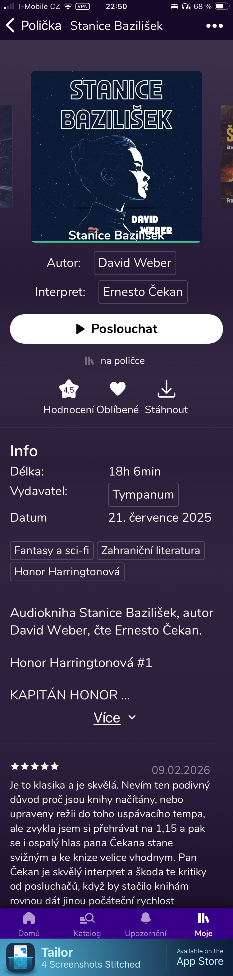
Book Detail: Five Screens Deep
Přehrávač
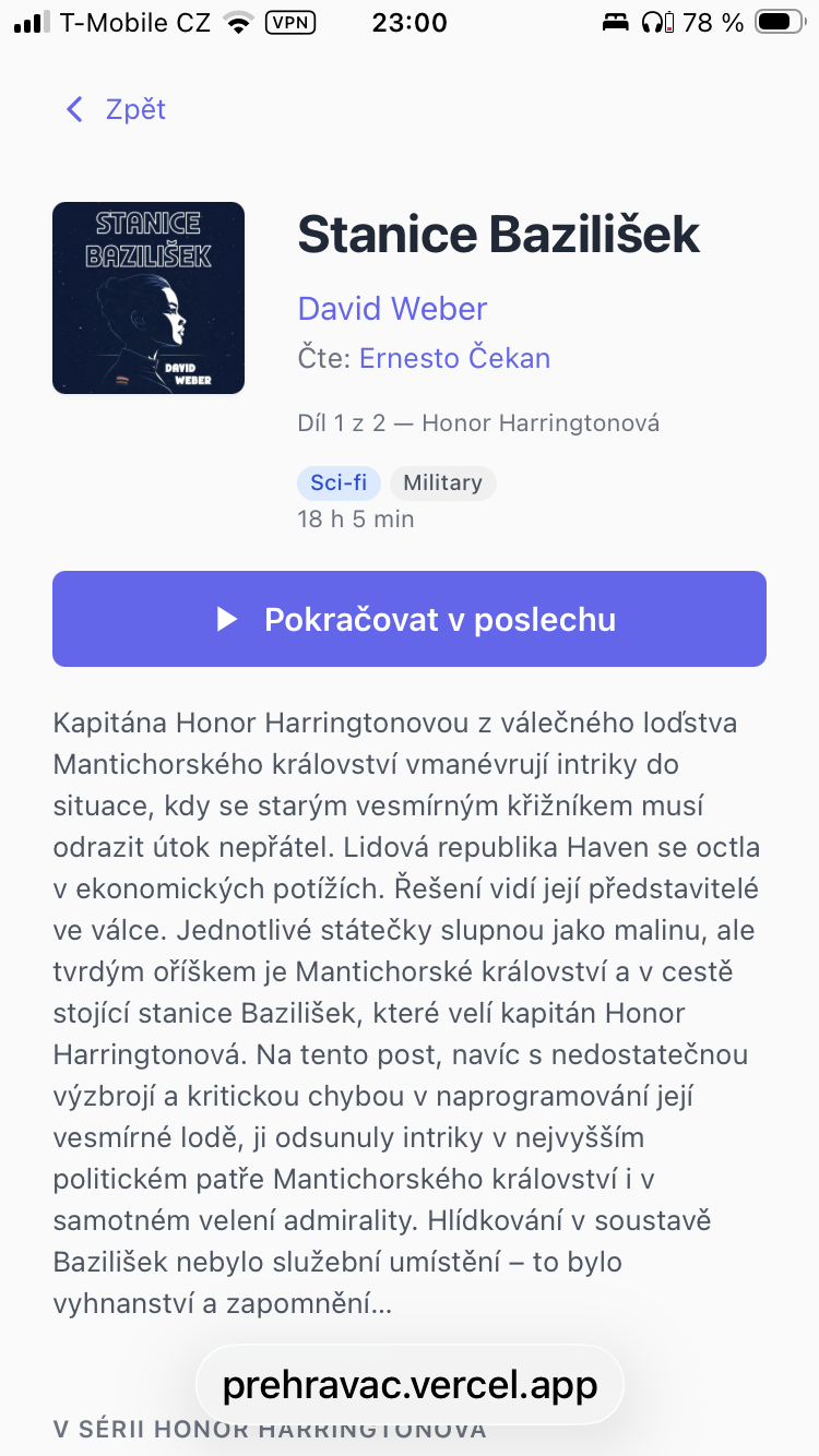
Book Detail: One Screen
To see what a single book is about on Audioteka, you scroll through five screens: a giant cover, redundant metadata, a collapsed description prefixed with boilerplate ("Audiokniha [title], autor [author], cte [narrator], rezie [director]"), and when you finally expand it — marketing copy, CAPSLOCK taglines, and user reviews. The actual story is buried four screens down.
Same book in Přehrávač. Metadata, player controls, and a clean description — all visible without scrolling.
Library
2,000 Books and No Way to Narrow Them
Most evenings the same question: what should I listen to next? I know I like a narrator, I'm in the mood for sci-fi — but I can't combine those. Tap a narrator and you see everything they've read: crime, romance, history. No way to say "just the sci-fi." So I scroll through a flat list, trying to remember what I've already heard.
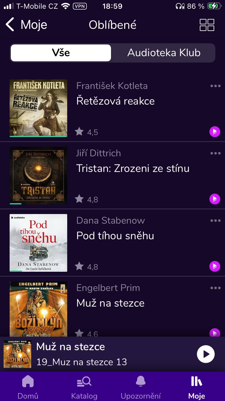
Audioteka
Library: Flat List, Single Filters
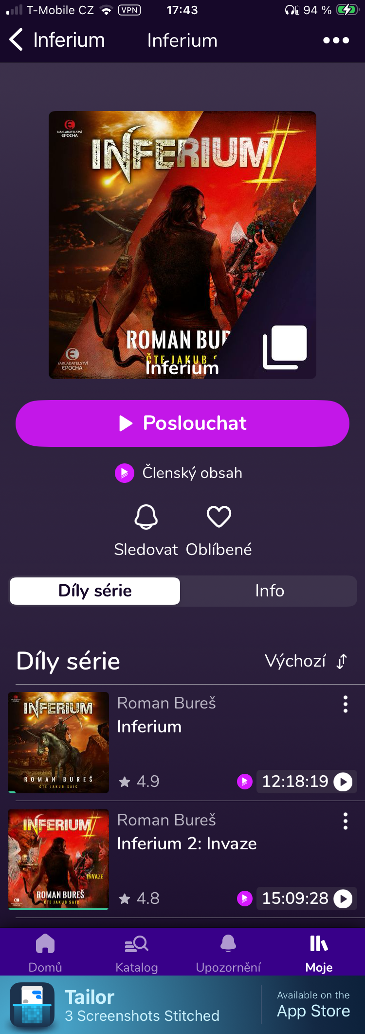
Cover + author + title + rating. Tapping a narrator filters by that narrator — but you can't combine it with genre or series. 119 favorites, no cross-filtering.
Přehrávač
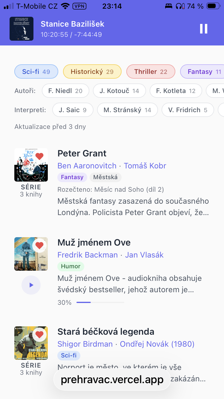
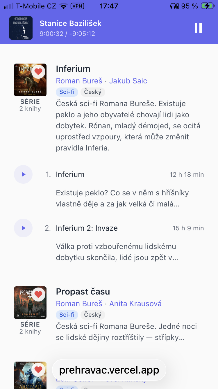
Library: Rich Cards, Combined Filters
Genre tags, narrator and author filters that combine. Series cards with position ("Part 6 of 7"), descriptions visible inline. Search across all metadata.
Player
Interruptions Are Always "About 10 Minutes"
Someone stops to chat, your mind wanders on a walk, you doze off for a bit — when you come back, you need to rewind. It's always roughly the same amount: five, ten, maybe fifteen minutes. Dragging a slider means guessing — you never know how much time you just moved. Tapping a dot that's always 5 minutes is a different thing entirely. You know exactly where you'll land.
Audioteka
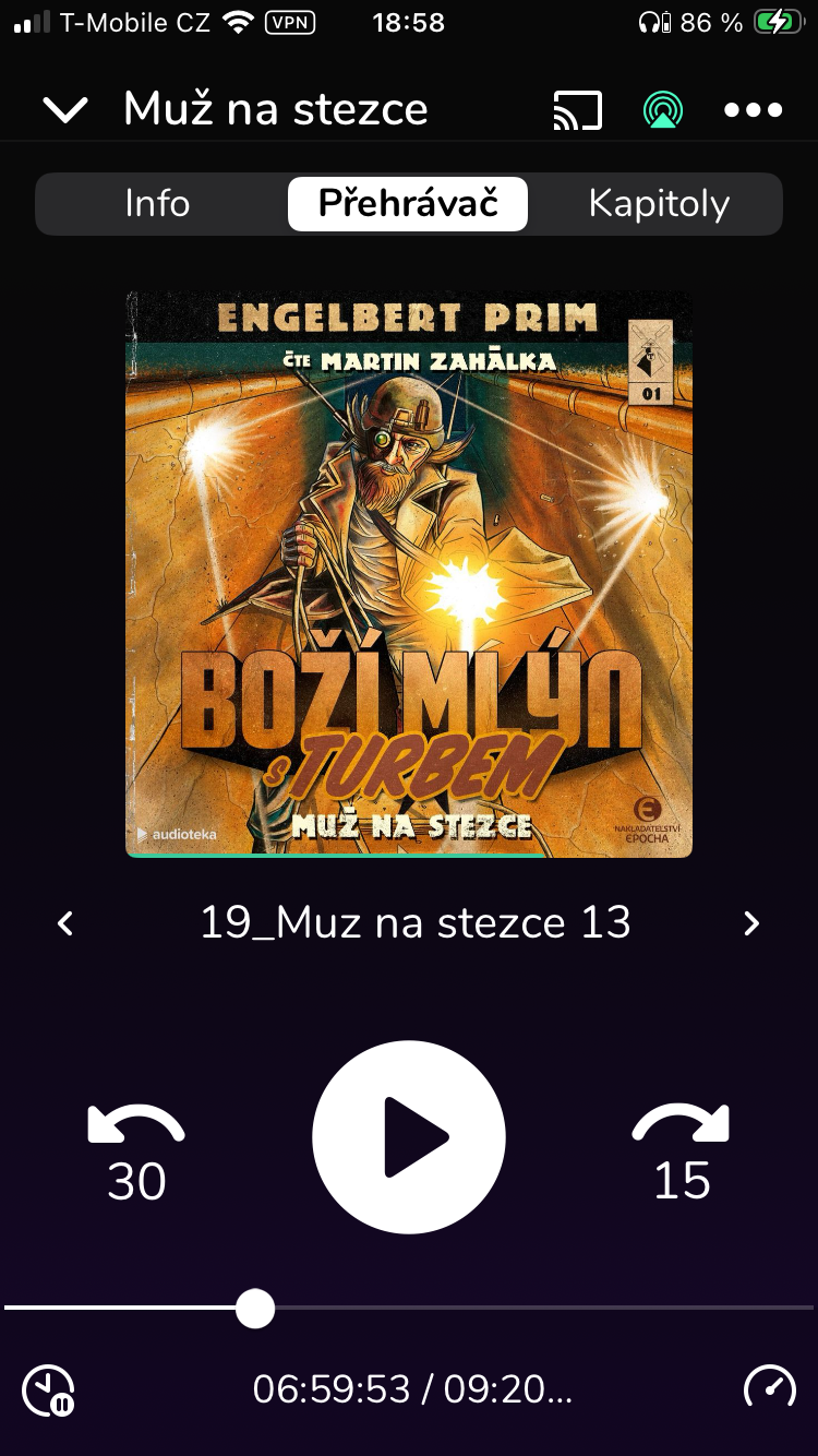
Player: Giant Cover, Chapter Seek
Cover takes 60% of the screen. Raw chapter name "19_Muz na stezce 13". Controls at the bottom — correctly placed for thumb reach. But the seek bar is chapter-level, not book-level.
Přehrávač
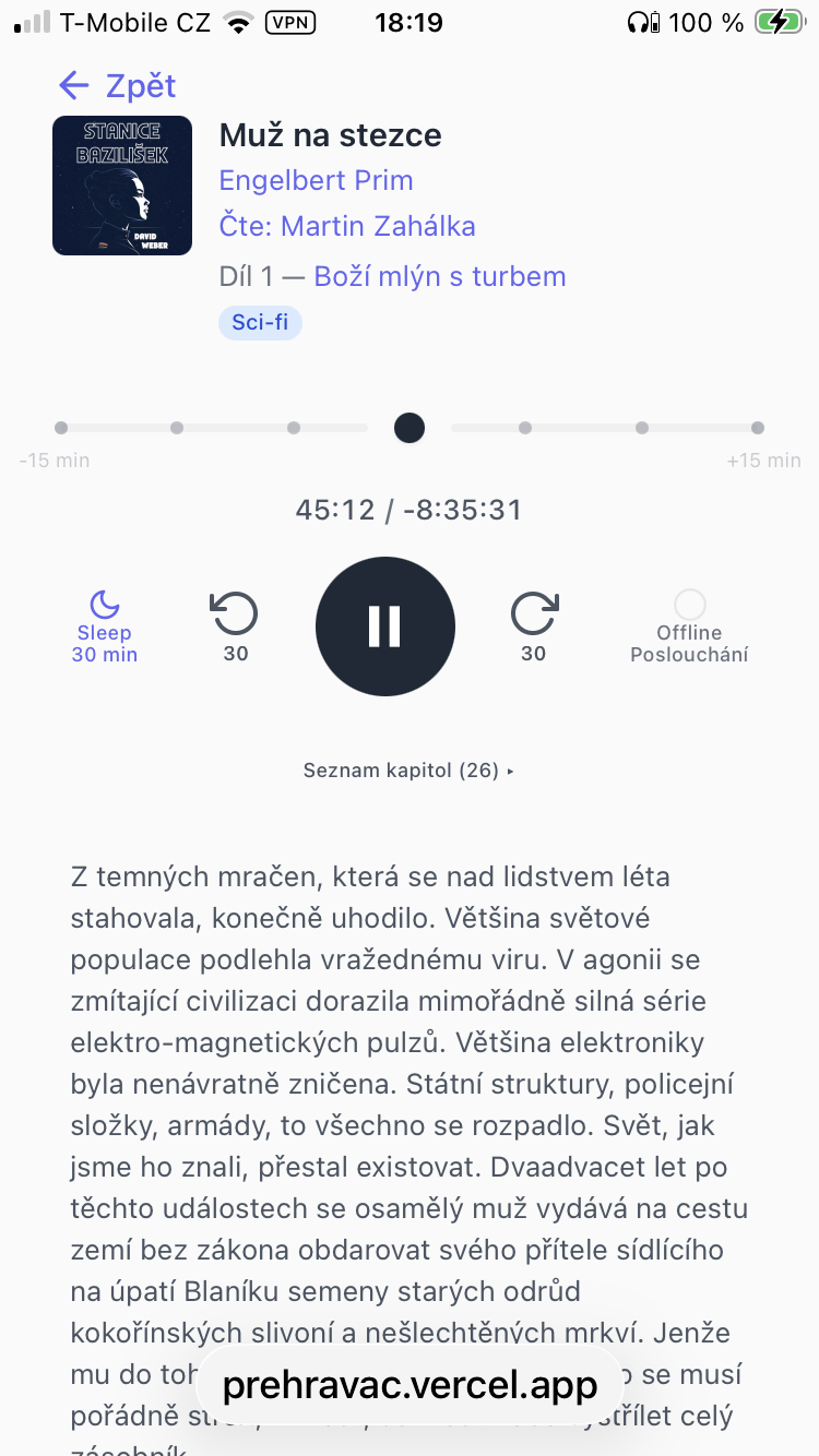
Player: Book Time, Dot Navigation
Small cover + metadata. Book-level elapsed and remaining time. A 30-minute seek window with 5-minute interval dots as tap targets. Sleep and offline as pill controls.
Series
Most of My Favorites Are Series
Honor Harringtonová, Boží mlýn s turbem, the Czech sci-fi I keep coming back to — most of what I listen to are long series. I want to know where I am: Part 3 of 7, not just a title in a list. And when I discover a new series, I want to know what it's about before committing to 50 hours of listening.
Audioteka
Series: Separate Page, No Description
Series are tagged in descriptions with #. But the series page itself is just a giant cover and a flat list — no part numbers, no description of what the series is about.
Přehrávač
Series: Expandable with Descriptions
"Part 6 of 7" visible directly in the library. Tap to expand: every book shows a 2-line description. AI-written series descriptions where Audioteka has none. Tap the series name to see all parts.
Design Insight
Before Building Clever Features, Make the Basic Interaction Right
Audiobook players play chapters. So the progress bar sometimes represents 8 minutes, sometimes 3 hours. I don't care about chapters. I care how much of the book is left.
The first solution was obvious: show book-level time and add ±30 minute skip buttons so users can jump past chapter boundaries. Then I built a sleep timer with a rewind feature — fall asleep for 30 minutes, wake up, and the player offers to rewind exactly those 30 minutes with one tap. It felt like a killer feature.
Then I redesigned the seek bar itself. Instead of a continuous slider, I built a 30-minute window centered on the current position, with 5-minute interval dots as tap targets. Want to go back 10 minutes? One tap on the −10 dot. Forward 5? One tap. The dots are large enough for a sleepy thumb at midnight.
Something unexpected happened: the sleep rewind toast — the "killer feature" I was proud of — went from essential to optional. When basic navigation is one tap on the nearest dot, you rely on clever workarounds less.
Many "killer features" exist only to compensate for bad basics. Fix the basics and the clever workarounds become unnecessary.
The AI Layer
Descriptions That Help You Decide
The backbone of this project is the player — offline playback that just works. But once that was solved, a natural next step emerged: I don't pick audiobooks by their cover. I pick them by what they're about and who reads them. Audioteka's descriptions make that harder than it should be.
So I built a cleanup pipeline: strip the boilerplate prefix ("Audiokniha [title], autor [author]..."), remove CAPSLOCK taglines and credit blocks, cut at the actual story. A typical Audioteka description is 3,000 characters of noise — the pipeline extracts the plot and caps it at 800. Then Google Gemini reads the cleaned text and generates genre tags (9 genres, 28 sub-genres), detects series membership through a 3-tier system (regex extraction, manual overrides for known edge cases, AI fallback), and writes short series descriptions in Czech.
Z temnich mracen, ktera se nad lidstvem leta stahovala, konecne uhodilo. Vetsina svetove populace podlehla vrazednemu viru...
Sci-fiPostapoPart 1 of 5Bozi mlyn s turbem
2,000 books, all with clean story-focused descriptions, genre and sub-genre tags for filtering, and series positioning. Not a replacement for Audioteka's data — a layer on top of it that makes the library actually browsable.
Invisible UX
System Handles Errors, User Does What She Came For
The features nobody sees are the ones that matter most when you're listening in bed with no signal. My design principle was simple: the system handles every error automatically. Toast notifications are a last resort, not a first response.
Auto-prefetch — background downloads the next ~30 minutes of chapters during playback. No manual download buttons.
Smart eviction — when storage fills up, a 4-tier system removes played chapters of other books first, protects the current book. No cleanup chores.
5-tier URL resolution — IndexedDB cache, in-memory cache, pre-resolved CDN, API proxy, graceful null. The player tries everything before giving up.
Auto-recovery — audio errors trigger automatic re-resolution. Reconnecting to network resumes where you left off. No manual retry buttons.
After the first day I went to bed with headphones on, listening to adventures of Captain Harrington, and I almost broke into tears when I put airplane mode on and it still played.
What Bothered Me
Small Things That Add Up
No signal, no playback. Offline requires manual downloads before every trip — and manual cleanup after.
Two audiobook platforms, two apps, no way to merge them into one library.
Fall asleep listening, wake up, can't find where I was. The progress bar shows chapters, not the book.
Want "sci-fi read by this narrator"? Impossible. Filters don't combine.
Book descriptions buried under boilerplate, credits, and CAPSLOCK marketing taglines.
Series exist but there's no "Part 3 of 7" on the card and no description of what the series is about.
What I Built
A Player for How I Actually Listen
Offline just works — auto-prefetch during playback, smart eviction when storage fills, auto-recovery on reconnect. Zero manual steps.
One library — Audioteka and Audiolibrix merged. 2,000 books, one player, one search.
Book time — elapsed and remaining for the entire book. 30-minute seek window with dot navigation. Wake up, tap the nearest dot, keep listening.
Combined filters — tap a narrator, add a genre, search by title. Names are navigation — every metadata field is a filter.
Clean descriptions — 3,000 characters of noise stripped to the actual story. Genre tags by Gemini. Pick by plot, not by marketing.
Series inline — "Part 3 of 7" on every card, expandable with descriptions. AI writes what Audioteka doesn't have.
What I Learned Building This
I'm a UX designer, not a developer. I built this with Claude Code — but the player wasn't the only goal. Before I started, I had a plan: create a reusable design skill that Claude applies to every project automatically. I picked GitLab Pajamas as the foundation, added principles I believed in — forgiving software, undo instead of confirmation dialogs, inputs sized to content — and started building. Every real problem refined the skill. "Names are navigation" came from fixing the library. "System handles errors, user does nothing" came from offline playback. The skill grew from a general template to 24KB of battle-tested patterns. The audiobook player was the real project. The design skill was the plan from the start.
The best personal tools come from solving your own frustrations — as long as you're honest about who the user is.